

Greenwich Real Estate Guy's Blog: How is the Market June 22nd
 Jared Randall
|
|||
|
|
|||
|

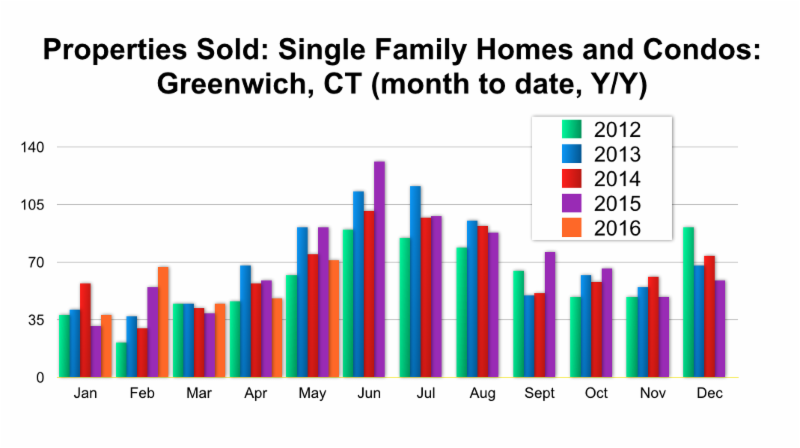 As you can see here the first three months of this year our properties sold were above the previous year. Yet, the last two months we are behind last year's activity. When you combine April and May last year there were 150 properties sold with only 119 over those two months this year.
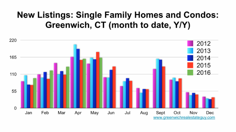
Conversely, when you look at the new listings they have been higher all year with this past month being the first drop. These are important charts to compare as it is showing we have had more inventory come on ytd (676) vs. last year (616), approximately a 10% increase but we have also had less sales this year (269) vs. last year (275) a 2.2% decrease. What does this tell us? It shows us that there is quite a bit more inventory than last year, with a small downtick in properties sold. The biggest take away with more inventory is that the pricing has to be right in this market.
The next two charts will break the market down by price point.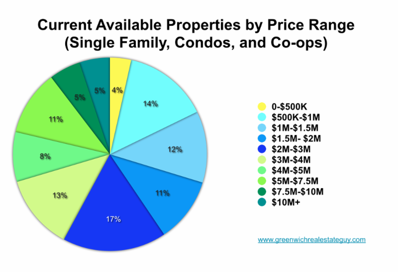
The above chart shows the percentage of the inventory in any given price point. It is important to compare where the inventory is vs what has sold.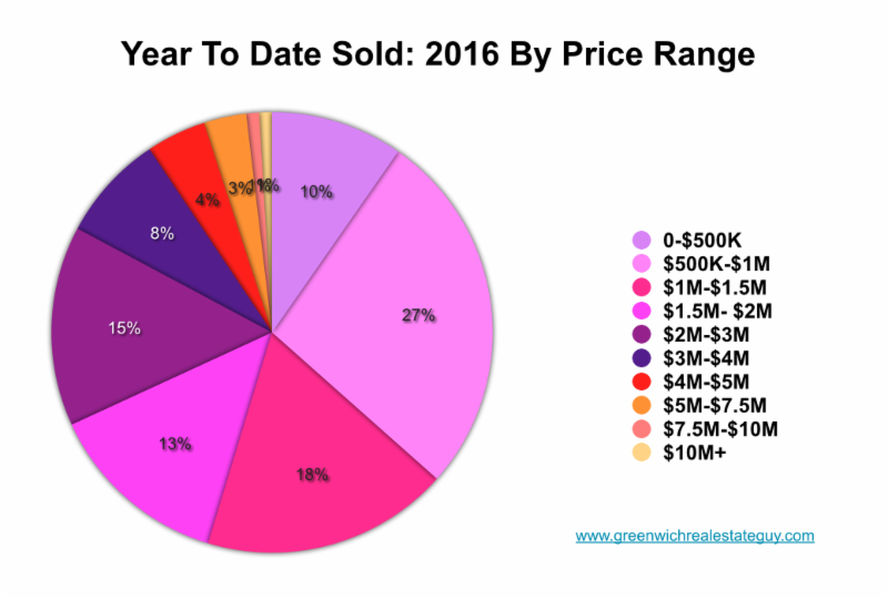
So, when comparing these charts you get a strong feel for the market. The under $2M market is 41% of the inventory but accounts for 68% of the ytd sold. Yet, when you look at the over $3M market, it only accounts for 17% of the sold properties, while it accounts for 42% of the inventory.
For each specific town click on the following to see the monthly report Houlihan Lawrence puts out:
Greater Greenwich Market Report as of June 22nd
Town Reports as of May 31st:
Greenwich
Cos Cob
Riverside
Old Greenwich
For readers that just follow on the Greenwich Patch I will not be posting all entries on the patch. You can read all postings at www.greenwichrealestateguy.com/blog. If easier, please subscribe here to receive each post. I have paid to open the MLS to you, so feel free to search properties based on your own parameters or set up a portal to get notifications on a customized search.
Reader Comments